lbs-alert
Component for showing messages
| Param | Explanation | Example value | Default value |
|---|---|---|---|
| text | Text to be displayed | 'Call this customer!' | '' |
| icon | Optional Font Awesome icon | 'fa-exclamation-triangle' | null |
| alertType | Type of alert | 'warning' | 'info' |
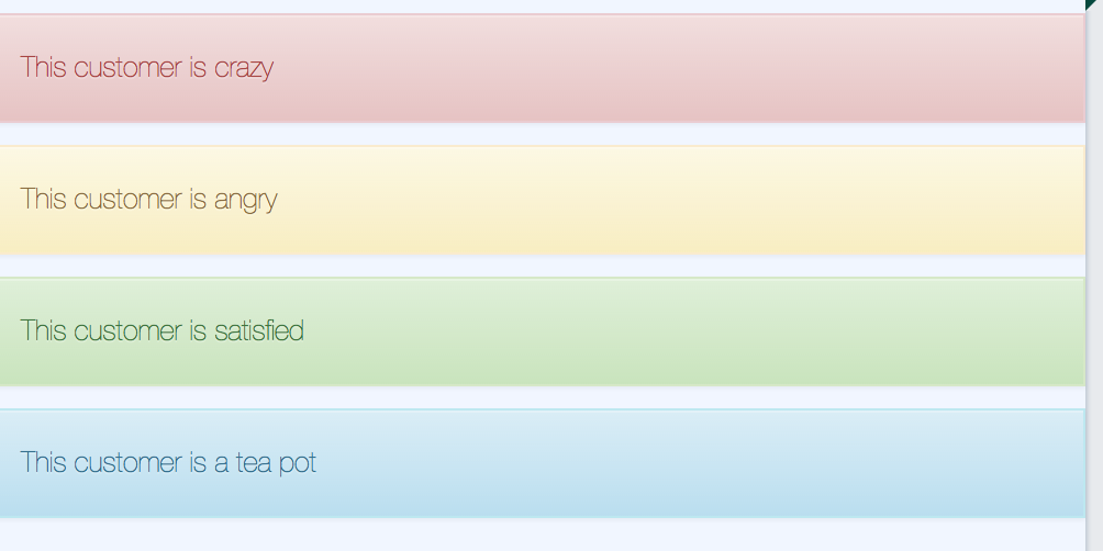
List of alert types and their corresponding colors: warning: yellow info: blue danger: red success: green
Info
See Font Awesome 4 docs for available icons
Child elements
If you want to add custom content to your alert, you can add this as child elements to the component.
Usage
<lbs-alert params="text: 'This customer is satisfied', alertType: 'success'"></lbs-alert>
Or
<lbs-alert params="alertType: 'danger'">
    <lbs-icon params="icon: 'fa-exclamation'"></lbs-icon>
    <span>Customer is maaad!</span>
</lbs-alert>