Lbs buttons
lbs-button
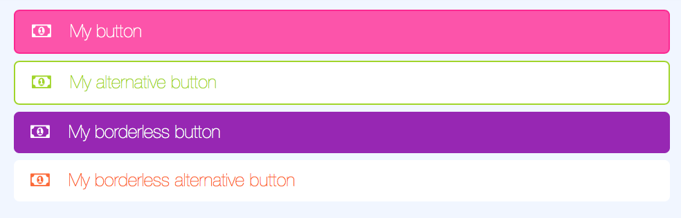
Lime specific button which can be styled using the official colors of Lime Bootstrap. These buttons will always have width 100% but will otherwise follow the Twitter Bootstrap styling.
Params
| Param | Explanation | Example value | Default value |
|---|---|---|---|
| color | One of LBS standard colors | 'lime-green' | 'turquoise' |
| bootstrapClass | One of Bootstrap button classes | 'btn-success' | '' |
| icon | Font awesome icon of your choice | 'fa-calendar' | null |
| text | Text on your button | 'My button' | '' |
| centered | Boolean for centering text | true | false |
| fullWidth | Boolean if button should be full width | false | true |
| alternative | Boolean if button should be styled alternatively | true | false |
| borderless | Boolean if button border should be excluded | true | false |
Info
See Font Awesome 4 docs for available icons
Warning
You cannot combine the params color and bootstrapClass.
Usage
<lbs-button params="text: 'My button', color: 'magenta', icon: 'fa-money'"></lbs-button>
lbs-button-group
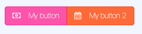
A component to group buttons together. Removes margins and border radius for edges between buttons.
Params
No params available
Child elements
The component lbs-button-group can be used with two different child elements:
Twitter Bootstrap buttons (using class .btn)
LBS buttons (using component lbs-button)
Usage
Using lbs-buttons:
<lbs-button-group>
    <lbs-button params="text: 'My button', color: 'magenta', icon: 'fa-money'"></lbs-button>
    <lbs-button params="text: 'My button 2', color: 'orange', icon: 'fa-calendar'"></lbs-button>
</lbs-button-group>
Using Twitter Bootstrap buttons:
<lbs-button-group>
    <button class="btn btn-default" data-bind="icon: 'fa-money', text: 'My button'"></button>
    <button class="btn btn-success" data-bind="icon: 'fa-calendar', text: 'My button 2'"></button>
</lbs-button-group>
lbs-split-button
A component to group two buttons together. The first button will take 80% of the width of the component and the second one 20%.

Params
No params available
Child elements
The component lbs-split-button can be used with two different child elements:
Twitter Bootstrap buttons (using class .btn)
LBS buttons (using component lbs-button)
Usage
Using lbs-buttons:
<lbs-split-button>
    <lbs-button params="text: 'My button', color: 'magenta', icon: 'fa-money'"></lbs-button>
    <lbs-button params="text: 'My button 2', color: 'orange', icon: 'fa-calendar'"></lbs-button>
</lbs-split-button>
Using Twitter Bootstrap buttons:
<lbs-split-button>
    <button class="btn btn-default" data-bind="icon: 'fa-money', text: 'My button'"></button>
    <button class="btn btn-success" data-bind="icon: 'fa-calendar', text: 'My button 2'"></button>
</lbs-split-button>
lbs-dropdown-menu
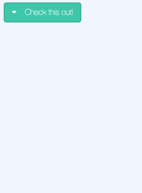
Component for listing items with optional actions.
Params
| Param | Explanation | Example value | Default value |
|---|---|---|---|
| color | Button color | 'magenta' | 'turquoise' |
| title | Optional button text | 'Check this out!' | '' |
| icon | Optional Font Awesome icon | 'fa-ellipsis-v' | 'fa-chevron-down' |
| fullWidth | Boolean if full width button | true | false |
| heroMenu | Used by lbs-hero. Should probably not be used outside of that | false | false |
| borderless | Boolean if button border should be excluded | true | false |
| items | Array with objects in the dropdown menu. | See below | [] |
Item configuration
| Param | Explanation | Example value | Default value |
|---|---|---|---|
| label | Text shown in the list item | 'Postpone' | '' |
| icon | Optional icon to the left of the text | 'fa-user' | '' |
| click | Javascript function to run on click | () => { alert('Hi') } | null |
| vba | VBA sub to run on click. Can be combined with click. | 'Module.Sub' | null |
| type | item or divider | 'item' | 'item' |
Note: All other parameters will be disregarded if type is set to divider.
Usage
<lbs-dropdown-menu params="title: 'Check this out!', items: [{ label: 'My menu item', icon: 'fa-bowling-ball' }]">
    <lbs-list-item params="text: 'Additional item!', icon: 'fa-calendar'"></lbs-list-item>
</lbs-dropdown-menu>